Technological advancement has touched virtually every aspect of the retail experience, and the packaging world is catching up. Specifically, augmented reality (AR) functionalities are helping some companies design packaging that offers additional value through digitization (without adding clutter). Plus, “smart” packaging elements like AR can be fun and exceptionally memorable. Let’s take a look at a couple examples, and why they’re so effective.
TECH-SAVVY TOOTHPASTE & PAPER PRODUCTS DESIGN
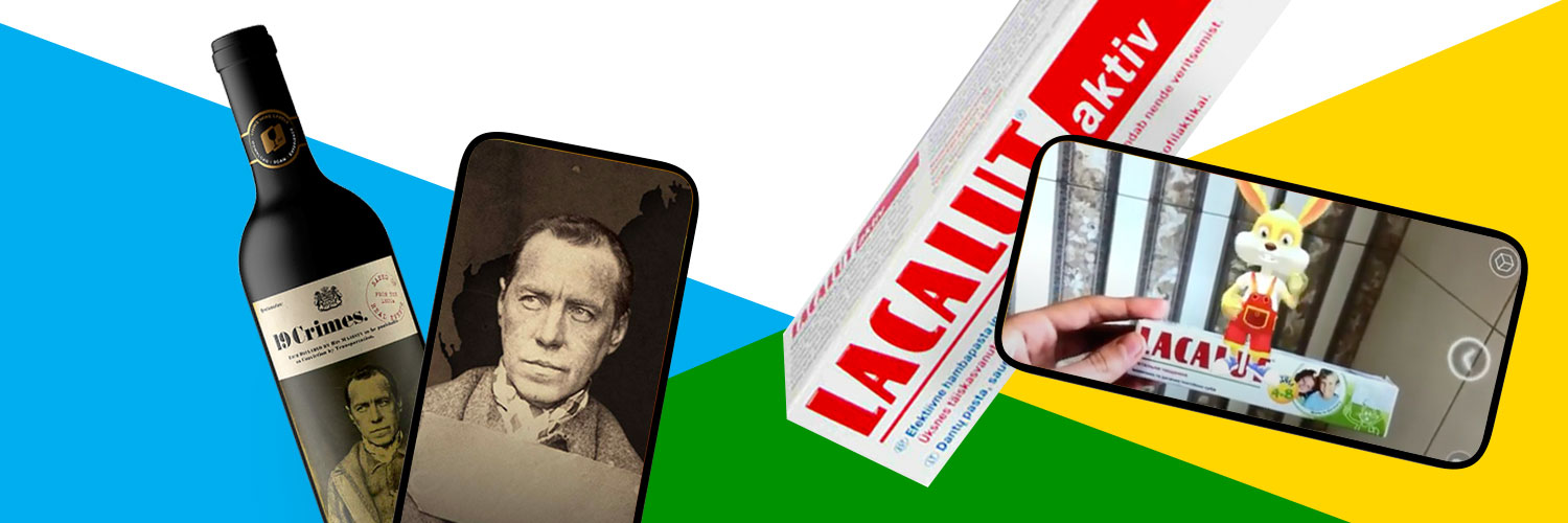
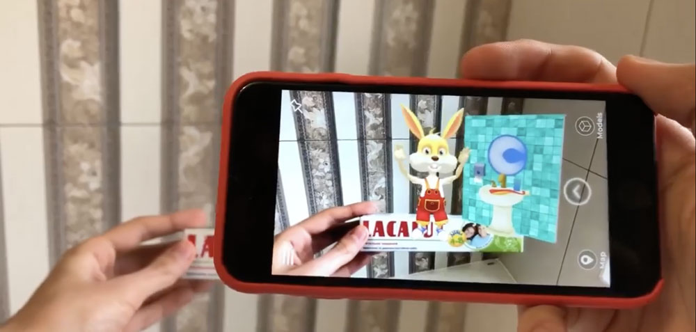
One common misconception about packaging that incorporates tech is that it requires special materials. German toothpaste brand Lacalut’s ordinary paper box displays a simple code that, when scanned with the custom created app, springs to life. Their mascot, the Lacalut bunny, jumps up (in your phone camera’s view, of course), stands on top of the box, and guides children through the basic steps of brushing their teeth. Thanks to the inclusion of this “smart” design feature, the box becomes a helpful (and fun) tool for young children. Parents will appreciate the brand’s dedication to getting children interested in oral care, and children will view brushing their teeth as a fun activity rather than a chore.
THE SMART ART OF LIQUOR (AND WINE) LABEL DESIGN
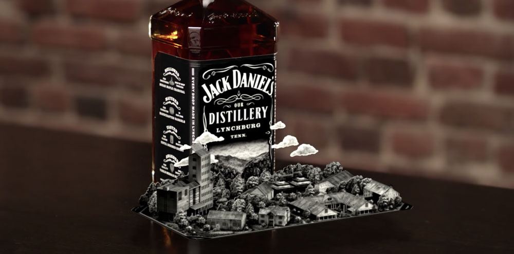
AR isn’t just fun and games for children’s products. Jack Daniel’s, the popular brand of Tennessee whiskey, used technology to highlight the rich history that has been a cornerstone of their branding. Upon scanning any bottle of Jack Daniel’s (or, more specifically, the iconic black and white label) with a smart phone, customers will see the label fold out, as if made of paper, revealing a detailed 3-D model of the Jack Daniel’s distillery. From there, customers can tour the facilities virtually, and explore the process used to create the whiskey. The Jack Daniel’s AR experience is remarkable, and highlights just how many amazing things are possible with the inclusion of smart packaging elements.
In a similar fashion, 19 Crimes wine has made a name for itself in recent years not just because of its quality product, but also because of its innovative approach to label design. Each bottle of wine from the Australian brand features an image of a real-life 18th century British criminal who was charged with at least 1 of 19 crimes (hence the name) and banished to Australia. The exploration of Australia’s history doesn’t end there: when scanned with a custom app, the photo on each label begins to move and tell the story of each criminal. The labeling attracted heaps of attention and praise, and helped the young company quickly rise to prominence in what is often a very competitive, unforgiving marketplace for new brands.


