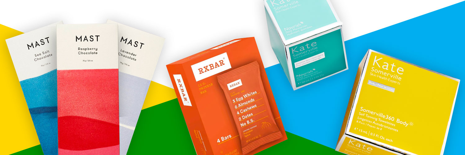
Minimalism has long been an important principle for designers looking for understated elegance, but it’s become an especially useful approach in recent years for young brands looking to make a statement. On crowded shelves with an extensive palette of colors, logos, and branded designs, clean design with lots of negative space can be an effective way to stand out, not to mention provide a resting place for tired shoppers’ eyes. Beyond that, minimalist packaging designs can help build an aura of transparency and honesty, inspire trust in what’s inside the box, and show confidence in the quality of the product.
KATE SOMERVILLE’S REJUVENATING SKINCARE PACKAGING
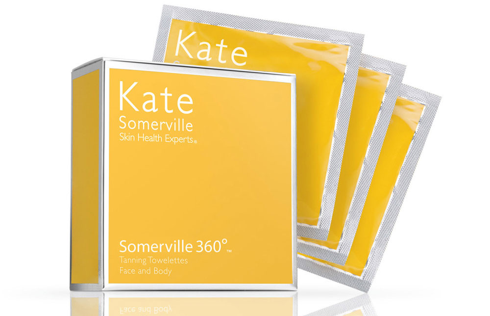
The clean packaging for Kate Somerville promises clean, ageless skin for its customers. For example, the edges of the brightly colored Somerville 360 boxes show off a shiny metallized polyester laminate, which provide a touch of extravagance on an otherwise straightforward design.
The brand has also pledged to transition to 100% recyclable packaging by 2025. Minimalist brands are not only simplifying design features, they are also trying to minimize the harmful effects of single-use plastic and nonrecyclable packaging materials. Starting of 2018, Kate Somerville stopped using plastic packing materials, reduced shipping box sizes, and switched to recyclable paper. The brand is also transitioning its makeup containers from single-use plastics to glass or ocean waste plastics.
RXBAR KNOWS HOW TO DESIGN PRODUCT PACKAGING
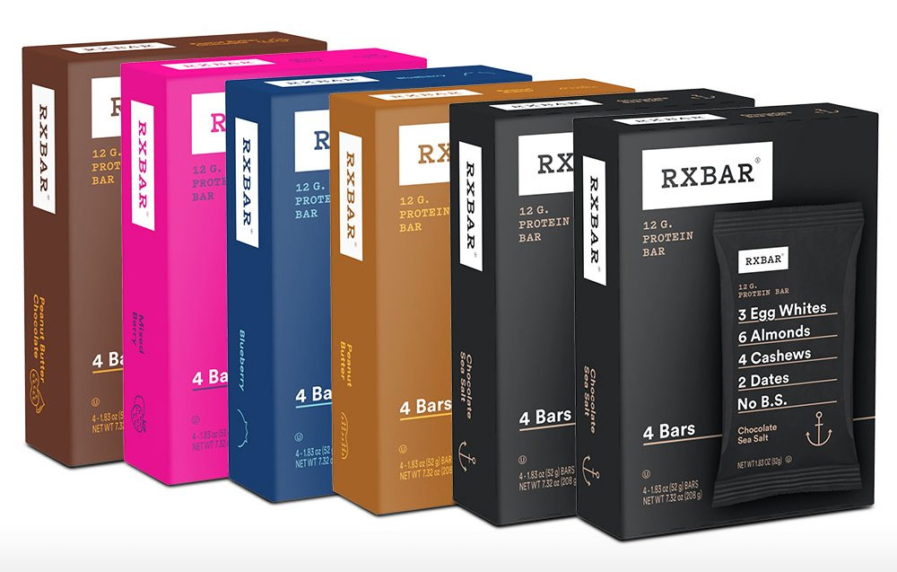
The paperboard boxes for Rxbar’s protein bars feature a simple presentation of information against a solid color background (denoting flavor), a small brand logo, and, front and center, a few lines of the ingredients. The design is clean, and the emphasis is on the text, suggesting that its customers—compared with those of competing food bars—care more about the bar than the marketing.
In other words, the design mirrors the brand’s promise of “No B.S.” by plainly stating the few quality ingredients that make up the foundation of each bar. The popular peanut butter chocolate flavor bar, for instance, exemplifies a minimalist approach to ingredients: 3 egg whites, 14 peanuts, and 2 dates. In their expanded ingredients list in a more standard format, they add in chocolate, cocoa, natural flavors, and sea salt. All in all, it’s a great demonstration of how design can deliver value to a brand (Kellog’s acquired the brand for $600 million in 2017).
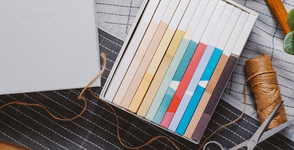
MAST’S ELEGANT CHOCOLATE BAR PACKAGING
Perhaps foods in bar form are at the forefront of minimalist design’s recent prominence, or perhaps it’s coincidence. Regardless, Mast Chocolate, much like Rxbar, has found sweet success in understated design. Their chocolate bar packaging features a restrained palette of colors, from the blackish browns for the dark chocolate to the ocean blue used for the sea salt chocolate. Block printing techniques add texture to simple splashes of color.
The elegance of the packaging also reinforces the brand’s commitment to sourcing only the best available ingredients, and their dedication to simplicity (as well as a short ingredient list). Vanity Fair calls the wrappers “sexy,” delivering an experience like “unwrapping a gift,” which goes to show that sometimes less really is more.
INSPIRING MINIMALIST PACKAGING IDEAS
Minimalism is certainly having a moment for brands, which may have something to do with the wide variety of package designs that beckon to today’s shoppers. Clean designs, negative space, swathes of colors, simplicity—all these traits have been resonating in many industries and will continue to do so. Hopefully, these examples have provided a bit of inspiration. For a closer look at minimalist design, and at other trends hitting the packaging world in 2021, take a look at our recently published guide.