In any industry, containers and packaging play a surprisingly integral role in a brand’s success. That said, there are industries where outward facing packaging can be especially important, namely when the marketplace is relatively young, when consumers are looking to form new brand loyalties, and when folks are still learning about the product and selecting from shelves overflowing with choices. One of those industries is the cannabis industry—we’ll let the numbers tell that story. In 2018, legal cannabis sales amounted to roughly $10 billion. Some valuations predict that by 2025, that industry will be valued at over $100 billion. Plus, public support for legalization reached approximately 66% in 2018, rising steadily each year from 2000’s 31%.
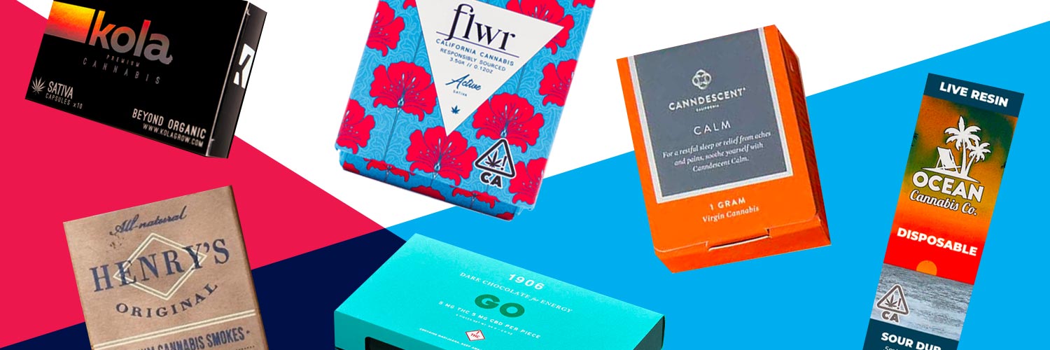
All in all, this industry isn’t just gaining traction, it’s absolutely exploding upwards. This means that new brands are continuously popping up to compete for consumer attention. Below, we’ll take a look at a few cannabis (and cannabis-derived products, like CBD) packaging designs. The brands featured here have done an exceptional job of creating innovative packaging that looks great and helps the product stand out.
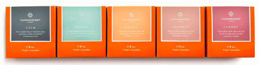
1. CANNDESCENT’S CALMING, CURATED CANNABIS CONTAINERS
Now that cannabis can be sold legally, there has been a notable shift from “traditional” cannabis packaging covered in marijuana leaves and trippy lava designs to premium, luxury packaging for high-end cannabis and CBD brands. Canndescent’s packaging exemplifies this trend—with five different effects ranging from Calm to Charge. Both the flower and pre-roll boxes showcase blocks of earthy colors complimented by the California cannabis company’s warm signature orange. The brand’s packaging is reminiscent of luxury jewelry packaging, most notably in its limited-edition gift sets. Each set opens like a jewelry box, showcasing the glass containers of flower with a sliding drawer that includes rolling paper and matches.
The bespoke brand’s commitment to “the art of flower” is a deliberate move that recognizes recreational cannabis as more than just a socially acceptable purchase; it’s a way to curate and enhance one’s life experiences. “What we’re actually doing is premiumizing an entire category,” said Canndescent CEO Adrian Sedlin in a 2019 interview about the brand: “We’re really about projecting light into the world and creating a happier, warmer place with joy, beauty, art, and all the better things.”
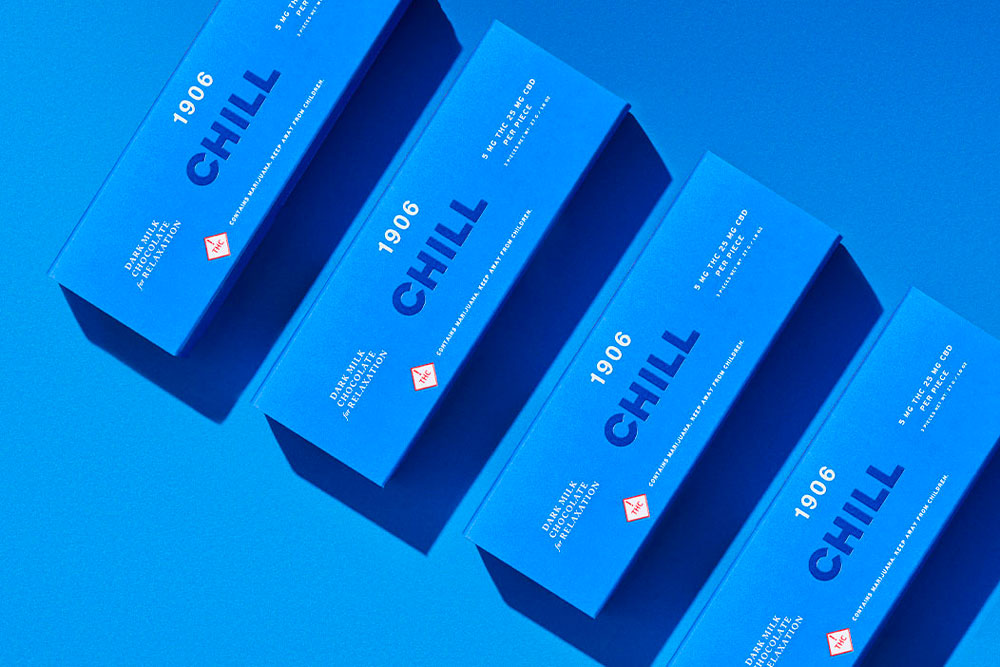
2. 1906’S (ALMOST) MEDICAL CANNABIS PACKAGING
Cannabis for medicinal use is nothing new, but cannabis companies today are able to manufacture desired effects on a hyper-personalized level, which is why the rise of edible brands is especially useful for those who want to control their high, particularly since smoked cannabis can be more difficult to measure and easily over-indulged by newbies. The packaging for the Coloradan edibles company 1906 was specifically designed with these consumer needs in mind. Its line of self-care edibles and pills combine different THC and CBD levels with other plant medicines in fast-acting, controlled doses that can ease anxiety, help you sleep, or even serve as an aphrodisiac.
The packaging for 1906’s premium chocolate edibles strikes the perfect balance of cannabis and chocolate packaging design, in cleanly designed boxes and tins that are color coded by effect with Skittles-esque shades. The products’ effects are simply stated in bold sans serif type, while the finely scaled informational text describes the product inside. Even prettier are designs of the company’s capsule tins. Taken as a whole, the packaging provides a fun but cohesive brand experience. For an easygoing brand that promises to deliver experiences customized to need, it’s clear that they’re taking personalized edible packaging to the next level.
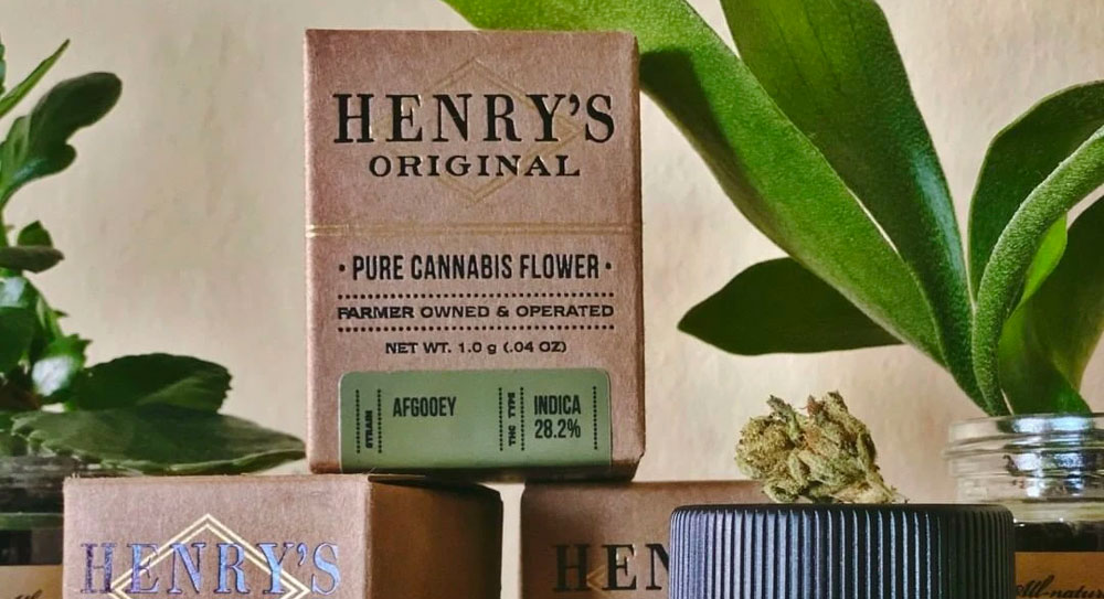
3. THE HERITAGE AESTHETIC OF HENRY’S ORIGINAL
No matter the industry, there is high consumer demand for products from honest brands that use natural ingredients. In this regard, Henry’s Original’s packaging gets back to its roots with classic design that isn’t pretentious. For the employee-owned, family farm company, “getting back to its roots” does not mean getting back to its days as a street drug, but back even further than that—to hemp farming and apothecaries of the past. The plain brown paper packaging is enhanced with subtle lines of gold foil. The classic black text printed on its boxes and glass jars has a vintage feel that harkens back to its agricultural origin. The packaging materials are also recyclable (the paperboard boxes) or reusable (the glass jars) ensuring buyers that the product inside is of the same high-quality—all natural, sustainably cultivated, and locally sourced.
The modest style of packaging Henry’s Original’s packaging also reflects the community-driven goals of the brand according to CEO and co-founder Jamie Warm: “Henry’s has become one of the largest flower companies and #2 pre-roll brand in California, according to BDS Analytics. Beyond that, it’s owning the legacy of Heritage Cannabis cultivation in Mendocino County and supporting the community in the process of transition from grey market to legal market.”
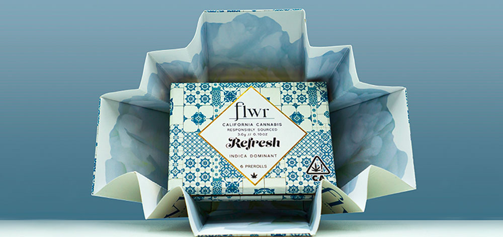
4. FLWR’S INVENTIVE CONTAINERS AND PACKAGING
Amidst a surge in minimalist packaging trends, quite a few newer cannabis brands are branching out and designing some really unique packaging designs. FLWR California Cannabis (distributed by Highline Distribution) swaps simple packaging design for something a bit busier but just as effective (if not more). A diverse range of colorful patterns decorate the boxes of the company’s different strains, giving each a different personality and flair. For example, the Energize box’s palm leaves mixed with flamingos is a funky twist on older marijuana packaging, Balance’s intricate gold foil diamonds bring elegance to a relaxing strain, and Creative’s paint strokes and splatters inspire.
Moreover, the company uses smart QR codes on its boxes to give buyers specific testing and cultivation information, and the frosted glass jars provide a stylish added layer of protection to the flower inside the box. The extra touch that makes FLWR’s packaging especially special is only revealed once it’s opened. Inside, each pre-roll box displays a mirror and the message “Lookin’ Good Babe!”—an empowering and inclusive endorsement of its community of cultivators and cannabis consumers.
5. ECO-FRIENDLY PACKAGING FROM OCEAN CANNABIS CO.
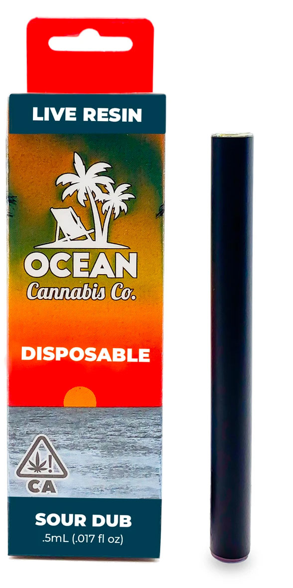
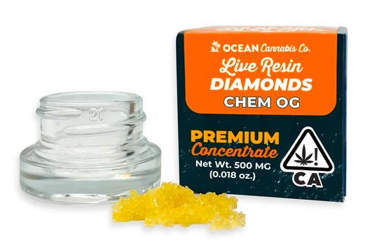
Historically, cannabis brands have had a hard time going green. Due to strict (and necessary) regulations requiring child-resistant packaging, the cannabis industry produces a massive amount of plastic waste. On the other hand, eco-conscious cannabis brands like Ocean Cannabis Co. have reduced their carbon footprint and benefitted the environment via innovative packaging solutions. The husband-and-wife founders, Patrick and Mary Ersig, were committed to reducing plastic waste, and spent a lot of time searching for the best way to do it.
Enter Oceanworks, which describes itself as “a global marketplace for recycled ocean plastic materials and products.” “All the plastic that we use, they collect from floating on the shores of Haiti,” Mary shared in an interview. “They actually go out and collect the plastic and turn it into the pellets.” Ocean Cannabis Co.’s packaging material is made from 100% recycled, reclaimed ocean plastic—each purchase from the family-owned brand equals 15 straws or one water bottle’s worth of plastic in support of the company’s mission to “smoke the ocean clean.” Design-wise, Ocean Cannabis Co.’s packaging adopts a beach-lover aesthetic, with sunset-over-the-ocean gradients and a standout white logo with a fold-out beach chair and five-leaved palm trees. This sustainable packaging draws in ocean lovers, and at no extra cost to buyers. The company has absorbed the extra costs of recycled packaging in order to deliver true value to its customers and further prove its commitment to making the cannabis industry even greener.
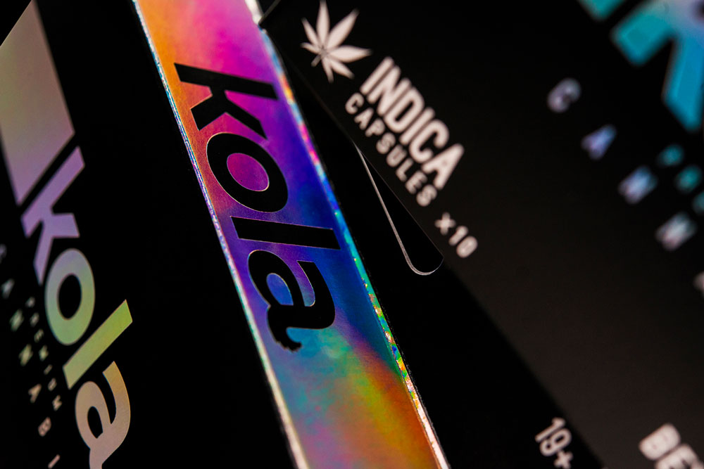
6. KOLA PREMIUM’S MODERNIZED PACKAGING DESIGN
Boxes and bags covered in trippy, holographic effects were a staple of early cannabis packaging design. Designed in 2016 by Hired Guns Creative, the packaging for Kola Premium Cannabis’ capsules has remained a standout example of original street style design rethought and repackaged for a more modern look. The sans serif text and single horizontal bar on the front of the box shines in a rainbow holographic foil, wrapping around the black box for a sleek 360º experience. The top edge of the box reverses the effect, with the black “Kola” logo sit into an iridescent background.
These prismatic effects are absolutely gorgeous, giving an otherworldly feel to the lowercase, four-letter logo. Named after the central flower cluster of a mature female cannabis plant, the kola name “[buds] from the end of a stem-like horizontal bar that grows responsively with the shape and size of each product. At the very tip of the brand, the spur of the letter ‘a’ unfurls with the serrate edge of a marijuana leaf.”
CANNABIS CONTAINERS AND PACKAGING MATTER
Across all subsections of the booming cannabis market, from CBD packaging to medical cannabis packaging, consumers are discovering new brands and forming allegiances to them. Cannabis brands have a great opportunity to stand out by virtue of having the most eye-catching, innovative packaging. A recent poll found that 72% of consumers say that packaging design influences their purchase decision, and given the conditions of this nascent industry, that number could be even higher. Hopefully, some of these great examples can serve as inspiration for other cannabis packaging design projects out there. It’s a competitive new market, full of contenders, and it’ll always be exciting to see how cannabis brands continue to raise the bar for innovative packaging designs.