As the budding cannabis industry continues to evolve, so does its packaging design. In the early days of legalized recreational use, cannabis brands were quick to embrace cannabis packaging designs covered in psychedelic images of marijuana leaves and smiley faces. At the time, the “street style” trend for a recently decriminalized street drug had massive appeal for a hip, young demographic. Now that brands have had skin in the game for a few years, packaging design has evolved. In this article, we’ll share a few of the most notable cannabis and CBD packaging trends of 2021. If you’re looking for a more in-depth exploration of innovations in packaging in the cannabis industry and beyond, be sure to check out our recent guide to creative packaging design.
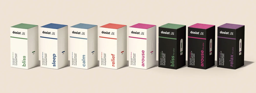
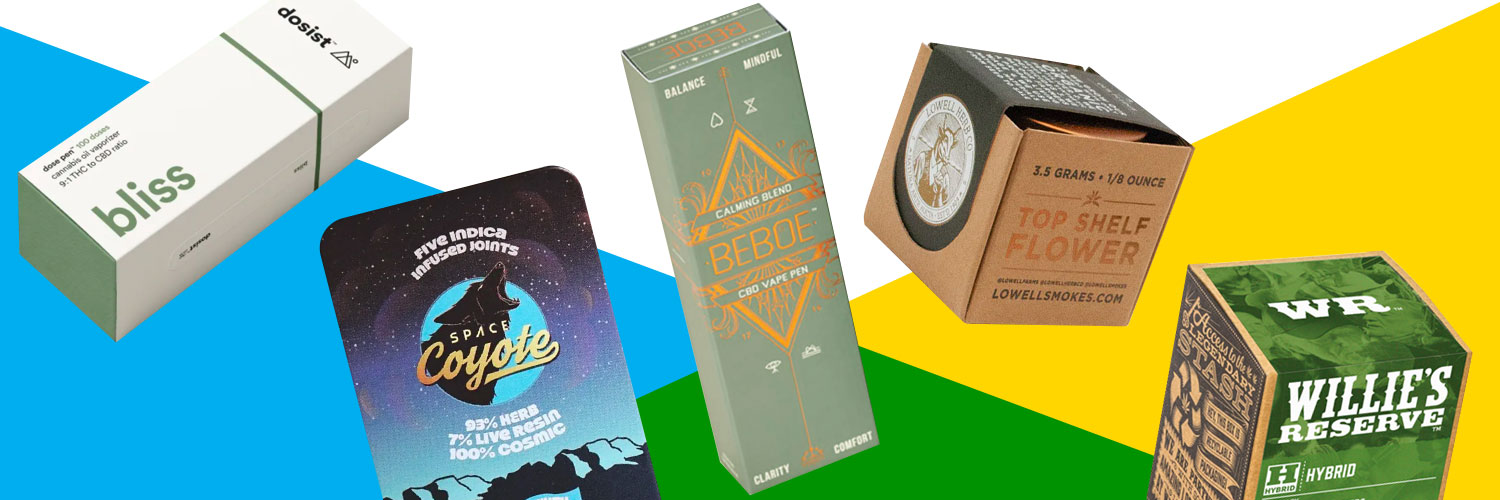
Nothing says “relax” like a simple, clutter-free aesthetic, which is why a number of cannabis and CBD brands are embracing minimalist packaging designs that would fit right into any pharmacy or wellness shop. One such company is dosist, a cannabis pen brand with medical-grade products that are customized to target specific health issues like insomnia, inflammation, and anxiety. The boxes are simple and functional—with clean, highly legible typography that showcases the benefit first, reinforced by solid blocks of color.
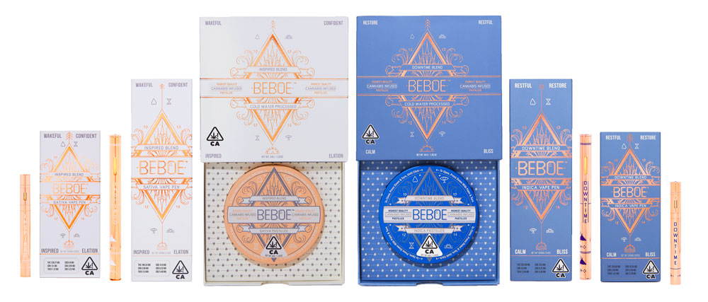
Looking to transform buyer perceptions of cannabis from a commodity to a luxury item, many cannabis brands have embraced high-end packaging designs that appeals to the sophisticated stoner. The cannabis brand Beboe explains that it was designed to be “discreet and elegant”—not exactly the two words that come to mind when describing vape pens and cannabis infused pastilles. But the packaging shows that they mean what they say, with intricate gold line drawings atop solid whites and pastel blues. The overall effect is as suggestive of high-end cosmetics as it is of cannabis.
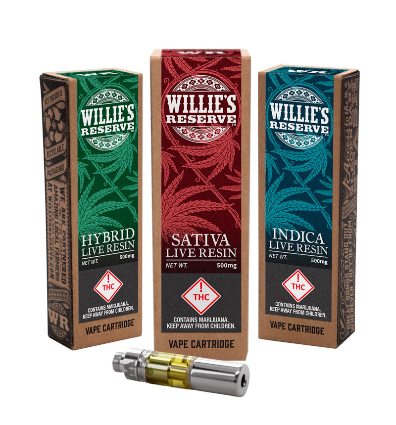
As a commodity, cannabis has an interesting history, which is why many cannabis brands embrace a nostalgic aesthetic in their packaging. For a fine example, look no further than Willie’s Reserve. Yes, that’s Willie as in Willie Nelson, the legend himself. The country-style typography is updated with leafy ornamentation, and applied to humble, folksy brown paperboard packaging. It all evokes an earlier era of Americana, updated for today’s markets.
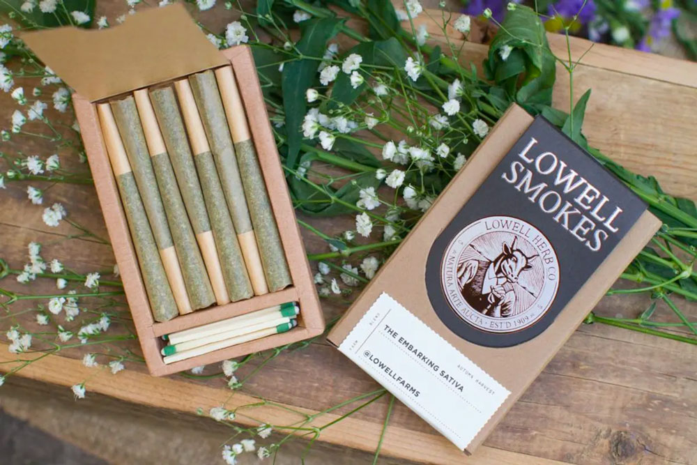
Despite the benefits associated with the natural herb, cannabis packaging has led to a significant increase in plastic packaging waste. Understandably, federal and state regulations require that cannabis is sold in child-resistant and tamper-proof packaging; however, the strict packaging guidelines tend to require large amounts of single-use plastic. Many brands are looking for alternative packaging designs that are plastic-free but still child-resistant. Lowell Farms, for example, made the switch from plastic to glass jars for its flowers and to biodegradable paper packaging for its pre-rolls. They are testing up-cycled magnets for child-resistant compliance, and while they aren’t recyclable, they are a step towards sustainable packaging. They also save on waste by including matches and a striker in every box bought.
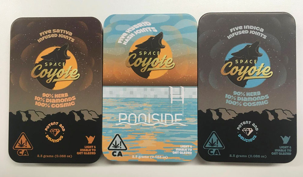
Every trend has its own countertrend. For the cannabis industry right now, that countertrend eschews chic and simple and embraces vibrant patterns and an otherworldly vibe. The packaging for cannabis brand Space Coyote does just that. With hippie text and desert imagery, this groovy packaging is immediately enticing. The pre-roll is especially otherworldly, with shiny holographic effects and night sky colors that recall hippie vans and peace signs.