The humble coffee bean packs a powerful punch. According to a National Coffee Association poll, 6 in 10 Americans drink coffee every day, and about 80% drink coffee at home. With countless household and artisan brands to choose from, coffee package design is a brand’s best chance to grab the attention of prospective customers. But function matters too—all coffee packaging is specially designed to keep coffee fresh, which is why brands must choose between using coffee boxes or one of the various pouch types (i.e. Doypack, flat bottom, side fold, quadro seal) and reopening features (i.e. an integrated zipper, a branded resealable label, foldable tin ties) wisely.
When it comes to branding, at-home coffee consumers are increasingly more likely to choose coffee packaging based on design (if they aren’t loyal to one brand already), and independent cafes are more likely to showcase coffee packaging that looks good. Coffee packaging design today follows many of 2021’s most notable product packaging design trends, with a focus on sustainability and minimalism paired with pops of bold color and design.
For designers looking for inspiration to energize their coffee bag and/or coffee box design, here are 10 examples from around the world worth checking out:
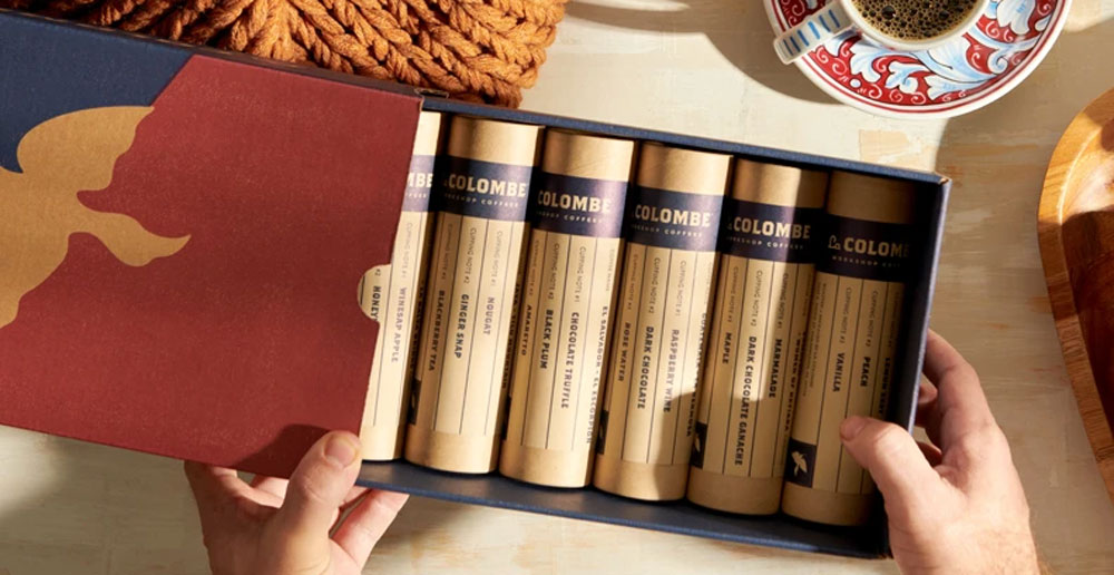
One of the early pioneers of direct trade coffee sourcing, US coffee roaster La Colombe designs each of its coffee boxes with a label that links the coffee to a locale. Each box included in the local roaster gift set, for example, gives you an idea of where the beans were roasted, with a transparent film at the bottom of the package to see the beans themselves.
An especially interesting instance of coffee packaging from La Colombe is the paperboard cylinder sleeves of the workshop sampler gift box. All materials, including the brand’s iconic outer box, are 100% recyclable and use plant-based inks.
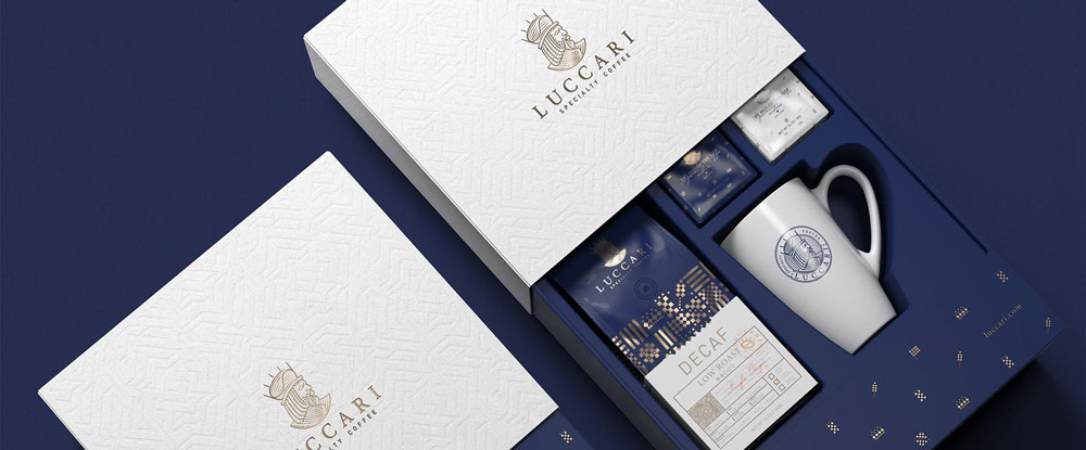
Luxury packaging takes extra care when it comes to the details. Take the packaging design for Luccari Specialty Coffee, for example. On a base of royal blue and white, each bag by the brand is adorned with bronze metallized images and patterns that evoke royalty and exclusivity. The gift set box extends the branding, kicking luxury up a notch with embossed elements.
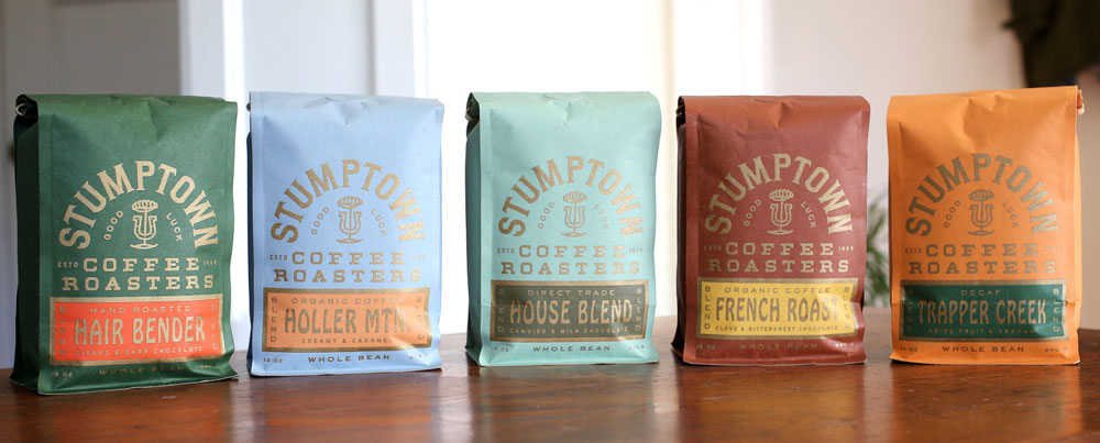
Over in Portland, OR, Stumptown Coffee Roasters’ coffee bags pay homage to the hard, honest work of coffee farmers. The typeface (Hobo), gold text, and colorful nameplates evoke an old-timey, farmhouse feel. They’re also made primarily of renewable wood pulp, making these biodegradable bags a win for sustainability.
To celebrate the limited release of Stumptown’s Grand Cru coffee beans, the brand’s kraft paper pouches are packaged in a luxurious navy box with delicate gold embellishments and geometric patterns. The company replicated the same art deco style on the labels for the Grand Cru cold brew bottles to highlight the craft and attention to detail that goes into the limited-edition coffee beans.
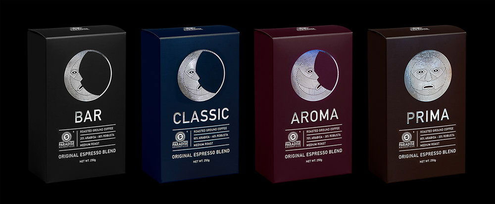
The coffee packaging for Ukrainian coffee company Paradise Gourmet Club’s espresso line is out of this world. To the moon, to be precise. Each box features a different phase of the moon depending on the strength of the blend; each moon (and blend name) shines with intricate lines of silver foil on a dark solid background. That’s not the only standout packaging from the coffee roaster—the gold foils on the black, paper-based tubes of its exotic collection gift set give the entire wooden box a premium feel.
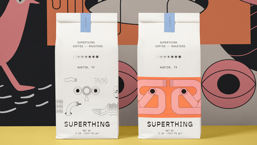
In Austin, TX, Superthing keeps things funky with surreal graphics. With a pastel swatch, each coffee bag features dynamic, biomorphic forms: there are knots of arms and legs, cyclops eyes, and cartoon speech bubbles to let you know where your coffee came from. With so much personality, it’s hard to choose just one—you could create an entire exhibit at the breakfast table.
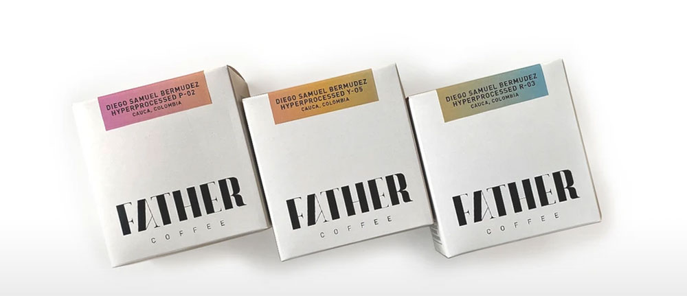
In Johannesburg, South Africa, Father Coffee roastery and espresso bar has made a name for itself with memorable coffee packaging design. Each coffee box makes use of generous white space, sensitive typography, and eye-catching surface effects. Most notable are the silver foil label of the Coffee Coffee box and the gradient colors of the Diego Samuel set’s labels. The brand maintains its minimalist design with its special release boxes—one covered in gold foil, one in bronze, and one in silver.
Lindfield Coffee Works, a roastery and coffee bar in Lindfield, UK recently redesigned its coffee bags to great effect. They now feature a black and white drawing of Lenny the duck, one of the many ducks that give the village its local charm. With all their ducks in a row, the brand is also committed to sustainable recycling efforts, bringing used bags to one of the only LPDE recycling plants in the country.
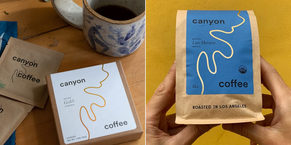
The brown paper kraft bag has become synonymous with artisan coffee brands. Its effect is homey and natural, but the labels on the LA-based Canyon Coffee’s bags add a refined elegance to the packaging. With subtle hues, each label features a rose-gold foil shaped like a canyon river.
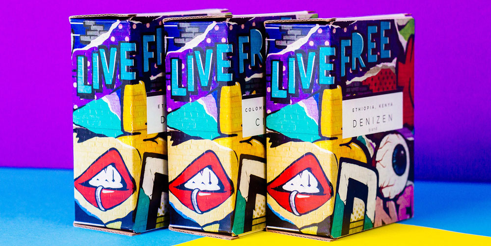
At first glance, the minty green and white coffee bags at City of Saints Coffee Roasters look quite simple. It’s not until you turn the bag that you see unique, vibrant street art designs that are common in this NYC brand’s Brooklyn neighborhood. The new packaging continues the legacy of brand’s 2016 coffee boxes, with unique graffiti designs wrapping around the entire box.
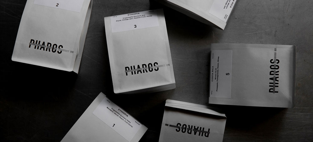
The monochromatic design of Pharos’ coffee bags is anything but ordinary. The Taiwanese brand aims for pure luxury with shiny, silver packaging complimented with a textured, shimmery laminate effect.