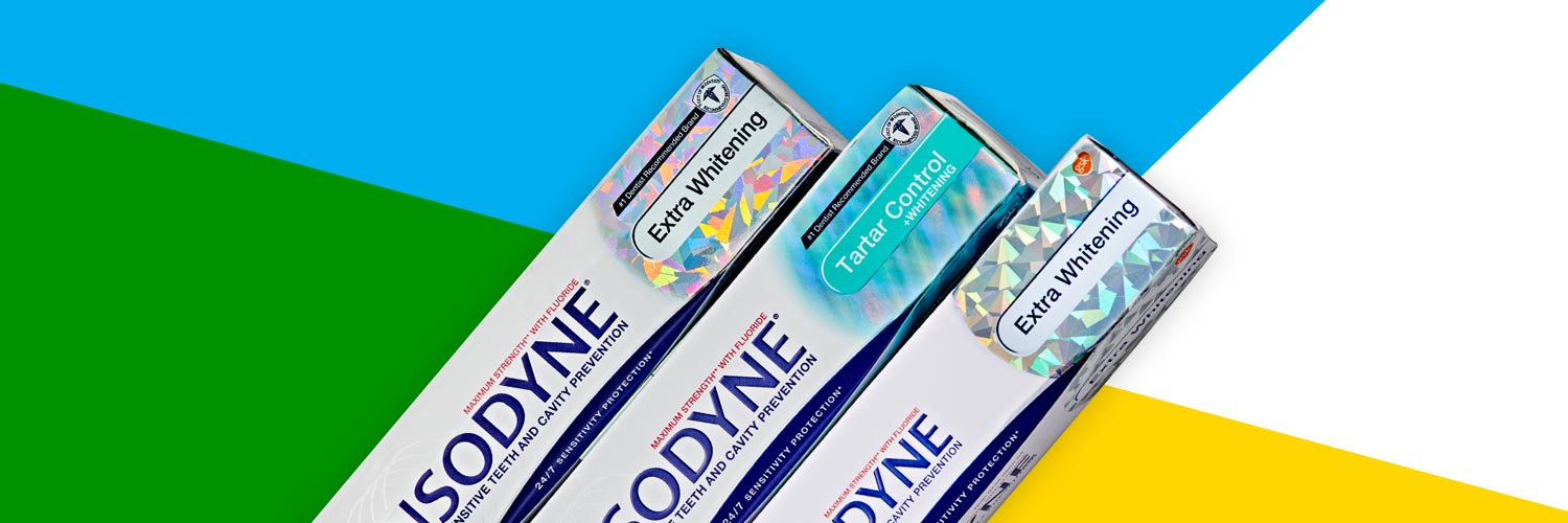
Consumer packaged goods (CPG) are, essentially, any items that average consumers use frequently. If that sounds like a broad category, that’s because it is, encompassing products ranging from cosmetics, to clothing, to food and beverages. Despite its size, the category is still growing; 2020 has thus far seen CPG sales hit $721.8 billion, rising up considerably from $635.8 billion in 2015. Given the size of the market, and the volume of competing products, attractive packaging that makes a product stand out on crowded shelves can be a brand’s best friend.
THE CRITICAL ROLE OF CPG PACKAGING DESIGN
Let’s start with a few numbers from a recent study. First, businesses that paid “strong attention” to improving their packaging noted a 30% increase in consumer interest. Second, 40% of overall consumers would share photos of packaging on social media if the packaging were interesting or gift-like. As 88% of consumers trust recommendations from people they know over ads or other forms of marketing, attractive packaging can be a powerful benefit for any business when it’s so amazing that others share it. There are plenty of other compelling stats, but we won’t belabor the point: consumers love great packaging. So how do you design great packaging with lasting shelf appeal? Let’s look to a few CPG brands that have nailed it and break down what works.
DELICIOUS CHOCOLATE PACKAGING FOR DELICIOUS CHOCOLATE
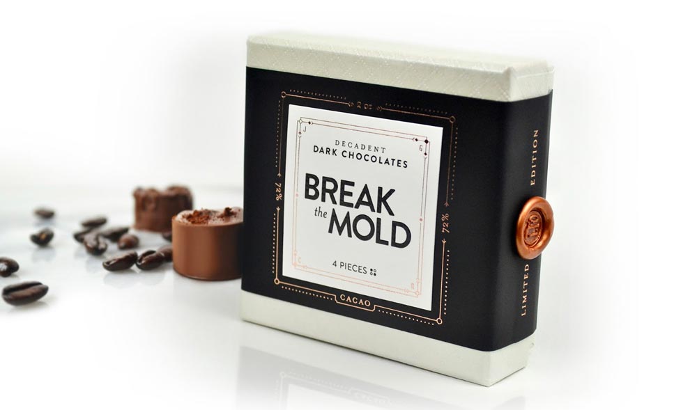
Okay, maybe the packaging itself isn’t delicious, but Break the Mold Chocolate’s limited edition packaging from 2017 proved to be a success, drawing attention and acclaim from consumers. Established brands tend to dominate the chocolate marketplace, so smaller companies looking to gain attention often shirk mainstream trends. Where many brands opt for bright colors and reflective plastic wrapping, this brand’s packaging was bound in a strip of dark, ultra-smooth paper, a subtle rose gold foil, and a wax seal. The contrast of these elements lends a unique artisanal touch to an otherwise plain paperboard box. Another example of stellar chocolate packaging was created by the Packvision Agency. Though it’s only a concept, the design turns heads with its holographically printed, textured patterns and typography. At first glance, it is simply beautiful—upon close inspection, the mesmerizing design invites endless exploration.
COSMETICS PACKAGING (THAT’S COSMETICALLY APPEALING)
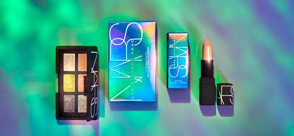
In an industry focused on beauty, shoppers expect cosmetic product packaging to have visual appeal. NARS, a leader in the cosmetics and skincare world, demonstrates the value of wowing consumers with its bold Christopher Kane collaboration. The packaging uses a holographic laminated paperboard that produces shifting hues of blue, purple, green, and yellow. The design elements are fairly limited; the thin font takes up little real estate, instead leaning on the stunning finish to close the deal.


