SPEAK FOR YOUR SHELF
It’s no secret that consumers aren’t looking at store shelves as much due to the pandemic, but brands that have neglected the importance of shelf appeal will be much slower to recover as the market recalibrates—and recent studies are supporting this.
An October 2020 survey found that 73% of shoppers miss in-store experiences and tactile experiences, while 71% miss casual browsing and discovery. The same survey revealed that 79% of shoppers are forgetting what specific brands have done during the pandemic.
Meanwhile, another report predicts that the retail market will start climbing back in 2021 by as much as 5.9%. When casual retail shopping finally begins to pick back up again, customers will be eager to get into stores and browse around, and they will have a more open mind about which brands they purchase. Shelf appeal will be a major force in boosting sales, and eye-catching package design is central to that. With that in mind, here are a few examples of great packaging ideas that could inspire your own shelf-appeal for 2021.
PACKAGING IDEA #1: UNIQUE BOX SHAPES
If you want your packaging to really stand out, change the shape of the package itself. Not only do unexpected packaging shapes immediately catch the eye—they also represent a brand’s commitment to detail and luxury.
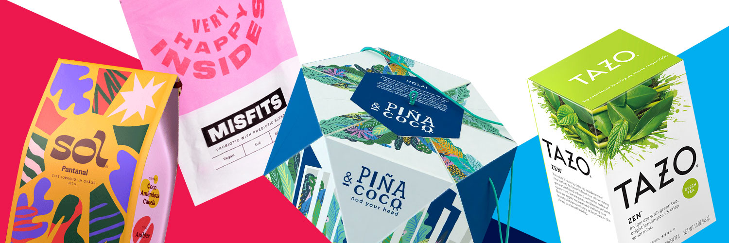
Take Piña & Coco’s hexagonal hat box, for example. The brand’s handcrafted Panama hats are packaged in artisanal triangle-sided boxes that open like a peelable fruit and are perfectly shaped for the hats themselves. The box also comes with a drawstring, effectively converting plain old packaging into a functional and stylish bag that will get people asking, “Where did you get that?”
Another innovative packaging shape comes from this this concept design for Bloomers lingerie. Each “petal” of the box opens just like a flower, tied with a hemp string for an ultra-luxurious effect.
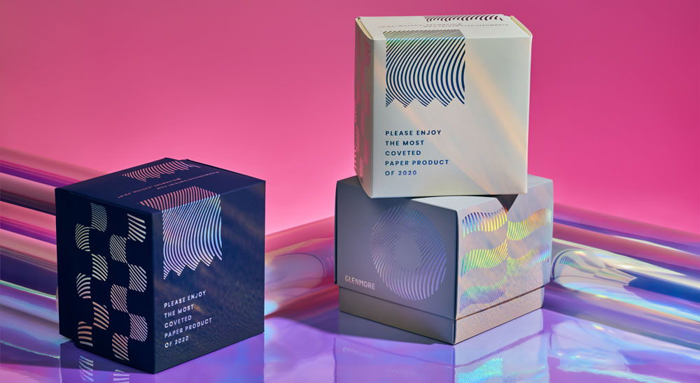
It’s worth noting that you don’t need a complex packaging shape to stand out—an unexpected packaging shape for the product inside works too. Glenmore’s 2020 Christmas Promo is a gorgeous, but tongue-in-cheek, holographic cube for an everyday commodity that usually comes in a wrapper: the toilet paper roll.
PACKAGING IDEA #2: GRADIENT DESIGN
Packaging that pops has been gaining in popularity, which is why many brands have opted for using bright, bold colors to catch consumer’s attention. A sub-segment of this color explosion, color gradients, is popping up more and more often, and can help a brand’s packaging stand out in a sea of boldly colored competitor packaging designs.
Foria’s CBD packaging boxes are stylish and modern, with gradients fading from orange to pink, from yellow to blue to purple that compliment the amber bottles inside. The colorful gradients convey a distinctive sense of calm—perfect for a CBD wellness brand that wants to stand out but not overwhelm. The same can be said of the packaging for Snowline’s light fruit coffee line.
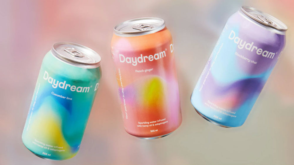
Gradients are great for brands looking to be a bit wilder, too. The labels for Daydream’s sparkling water cans are bright gradients that swirl across the can like the Northern Lights, with different color combinations for each flavor.
PACKAGING IDEA #3: STARGAZING AT HOLOGRAPHIC BEAUTY PACKAGING
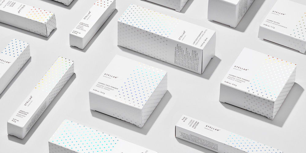
Beauty product packaging ideas need to instill confidence in the buyer that the product will be, well, beautiful. Stellar, a popular makeup brand, draws its inspiration from the cosmos. The packaging accomplishes beauty with tactful holographic lamination—swathes of white and black paperboard represent the contrasts of night and day, and its subtle holographic dotting creates a dazzling, opalescent shine. This packaging is a masterclass in using bright, luminescent materials as a subtle calling card, and shows how vibrant laminates can be used delicately to wonderful effect.
Other brands are embracing subtle uses of holographic foils. Material Art Fair, a contemporary art expo, opted for this approach in its promotional materials, with one standout example featuring a plain grey box and a swirl of holographic-laminated text. Lorient, a door sealing manufacturing, released its high-end products with a brand identity booklet featuring simple grey and white coloring adorned only with holographic-foil lettering.
PACKAGING IDEA #4: GET FUNKY WITH TYPOGRAPHY AND FONTS
Brand names and product information really matters—which is one reason why typography decisions are treated seriously. But not too seriously. Brands are putting emphasis on fun fonts front and center, opting to make the text even more meaningful through surprising typography and design decisions.
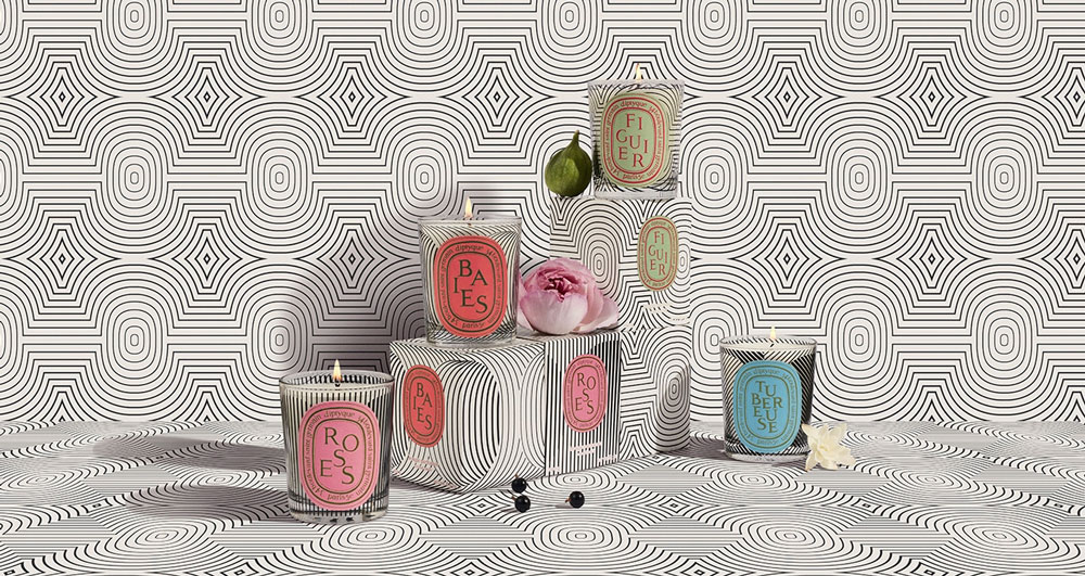
First up is diptyque’s limited edition Graphic Collection. Recalling its graphic heritage, the 60-year-old French perfumier launched candle boxes with trippy optical illusions in black and white. The design here is mesmerizing, and the brand’s classic oval branding makes it truly stylish and unique. In signature fashion, the characters of the scent names are composed like a picture rather than in a straight line. The name makes you pause just long enough to take in the smaller text around the edge displaying diptyque’s name and address.
Another great example comes from Misfits, a protein and supplements brand that gave each of its plant-based, plastic free powder packs a distinctive typographic twist. The “Very Happy Inside” pack is in the shape of a smile, the “Immunity Boost” pack literally boosts itself off of the ground.
While these brands made bold typographical decisions with more traditional typefaces, there’s also something to be said for getting funky. Check out the hippy font in green foil on Best Studio’s Merryjuana packaging or the wavy twists of the brand name for Sol, an organic coffee box concept design.
PACKAGING IDEA #5: PLASTIC-FREE PACKAGING SOLUTIONS
It’s high time for brands to hop on the sustainability train, especially now that big names are introducing eco-friendly solutions like those seen in Seventh Generation’s paper laundry detergent bottles and Colgate’s recyclable toothpaste packaging.
Consumers are growingly more eco-conscious, meaning that they’ll be looking for explicitly recyclable or sustainable packaging options more and more. In the drive to reduce plastic waste, paper packaging reigns supreme (and it’s generally cheaper to manufacture, too). Top CPG brand Procter & Gamble, for example, is launching new plastic-free packaging for two of its deodorants—made from 90% recycled paper and certified by the Forest Stewardship Council (FSC). It’s aluminum free, too.
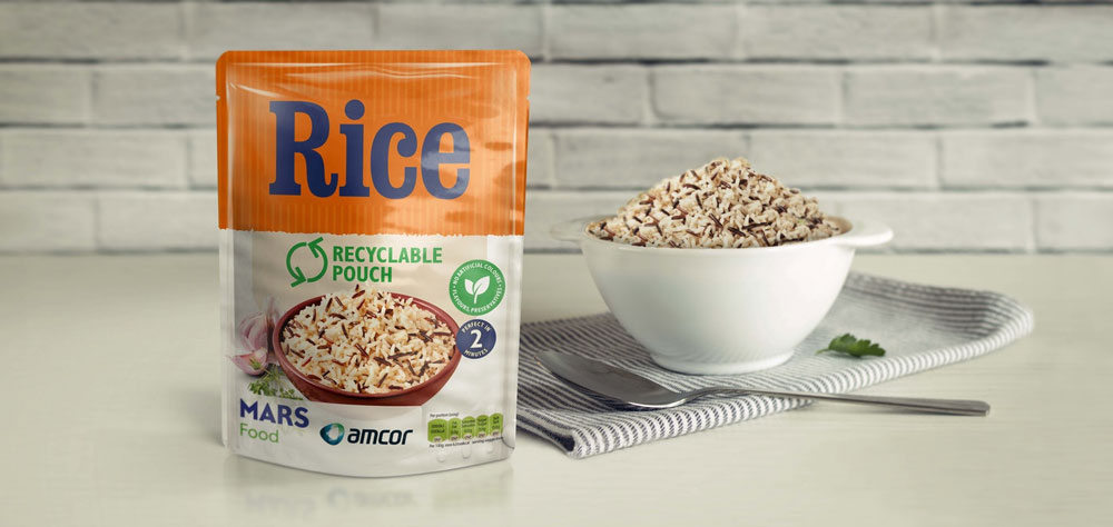
There are a lot more sustainable packaging solutions on the horizon. In mid-2021, Mars Food is planning to launch a line of recyclable, microwavable rice pouches for a number of household brands, overcoming the challenge many companies face when attempting to design food safe packaging that meets legal packaging requirements and guidelines.
PACKAGING IDEA #6: BOLD GRAPHICS FOR EVERY FLAVOR
Cohesive design is essential for brands that have a range of products with different flavors or scents. While changing the color or patterns for each flavor is a great way to do that, other brands have taken it a step further, giving each iteration of their product its own graphic as well.
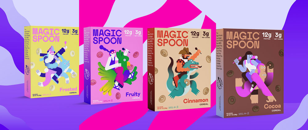
The keto-friendly cereal brand Magic Spoon is reaching its adult audience through nostalgic character designs. Each cereal box is branded with its own mascot, illustrated by surrealist artist Levi Jacobs for a more mature, high-end twist on classic cereal characters. There’s a wizard on a bunny and a bearded cowboy on an alligator, for example (and by the way, check out the gradient color on the side of the box!).
The flat graphics of leaves and flowers on the packaging for KOi’s Australian skincare line are all different, with different colors and fruits displayed depending on the scent. The bottles and boxes are largely white with small, black text, so the bold panel of graphics really pop. Tazo Tea, on the other hand, uses photography on its packaging, but the pictures are just as bright and beautiful.
PACKAGING IDEA #7: THE FUTURE IS BRIGHT (FOR MINIMALIST PACKAGING IDEAS)
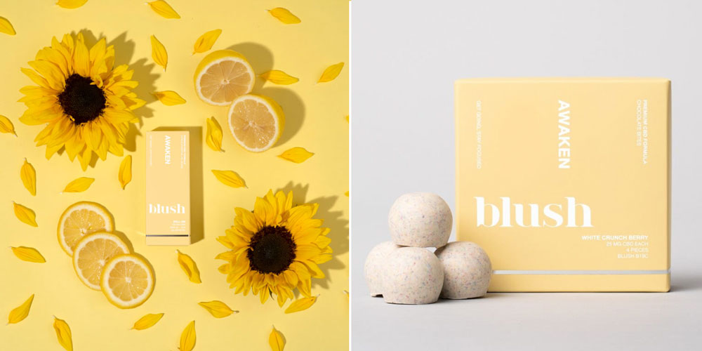
Minimalist design has a staying power that may make it more of a mainstay than a trend, but as we discuss in our 2021 trends report, brands are nonetheless adopting this approach at an increasing rate. One phenomenal example is Blush Wellness, a CBD company distinguished by its simple, bright packaging. Their ‘awaken’ chocolates, for example, come in packaging that aims to evoke morning light, energy, and focus through its predominantly soft yellow exterior. The sheer color and subtle type will immediately draw in the attention of shoppers.
THE VALUE OF INNOVATIVE PACKAGING DESIGNS
Innovation comes in many forms, especially in a field like packaging design, as design trends and consumer preferences fluctuate. It takes a hearty dash of creativity for packaging ideas to really stand out, but diverse techniques, laminations, and materials can provide a wider range of possibilities for designers. Good things are on the horizon for companies looking to make an impact with packaging, and when the marketplace begins rebounding, it’ll be important to have inspired packaging designs ready.
FREQUENTLY ASKED QUESTIONS
For more packaging ideas, check out our blog, creative packaging guide, and 2021 packaging trends report. In addition to those, here are 4 of our favorite resources for creative packaging trends and ideas:
Packaging inspiration can come from all sorts of unexpected places. Apart from the resources listed above, pay attention to packaging on store shelves the next time you go shopping, or check out some competitors’ websites in your industry to see what’s already out there. We also recommend browsing sites like Behance and Pinterest.
Packaging is the material structure that houses a product. It’s the tin to your cookies, the glass to your perfume, and the box to your tissues. Packaging protects your product and makes it easy to transport, but there’s more to it than that. It also promotes your product on the shelf, displays important product information, and tells the story of your brand, which is more crucial than ever given the wide range of available products and the sheer number of existing brands.
CPG stands for consumer packaged goods, which are items that are used daily by most consumers and require regular replacement. A lot of products fall into this category, such as food, beverages, toiletries, cleaning products, and makeup.
When looking for a packaging supplier, there are many things to consider, including your budget, the packaging materials you want to use, a supplier’s inventory, and if said supplier’s capabilities can help bring your packaging design to the next level. It’s also worth asking about their sustainability efforts and if you can talk to a supplier’s other customers.
P.S. If you’re looking for a paper and board packaging supplier, we may know someone who can help (hint hint, it’s Case Paper)