THE ULTIMATE GUIDE TO CREATIVE PACKAGING IDEAS
In this guide, we discuss
WHAT IS CREATIVE PACKAGING?
Package designers know that packaging that simply “holds something” isn’t good packaging. Good packaging is more than a vessel; it’s one of the most important elements in a brand’s marketing arsenal.
It’s no wonder that 31% of global consumers say packaging is extremely important to their overall satisfaction with a product. On store shelves, or even in an e-commerce setting, eye-catching, innovative packaging is crucial in shoppers’ buying decisions.
Brands today face many challenges, but smart brands know these demands also present opportunities. They know that packaging that solves problems differently can help their products stand out. But it takes creativity to design new solutions that address issues like user experience, sustainability, shipping, food safety, and more. To get a better sense of how creative packaging design is tackling these challenges, let’s take a look at a few examples across specific industries.
CAN’T MISS CANNABIS PACKAGING (AND CBD PACKAGING)
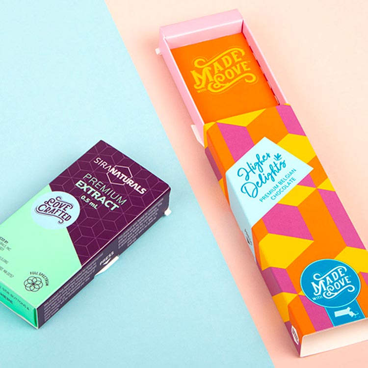
Cannabis is a rapidly evolving industry with an explosion of new products, most of which don’t have name recognition yet. Those factors breed a lot of differentiation as brands strive to be seen and remembered. So naturally, companies are looking to dress up their product in more than a plastic bag and stand out from the pack in any way they can for a younger audience. Indeed, one cannabis branding expert refers to cannabis packaging as the “street style” of the packaging industry.
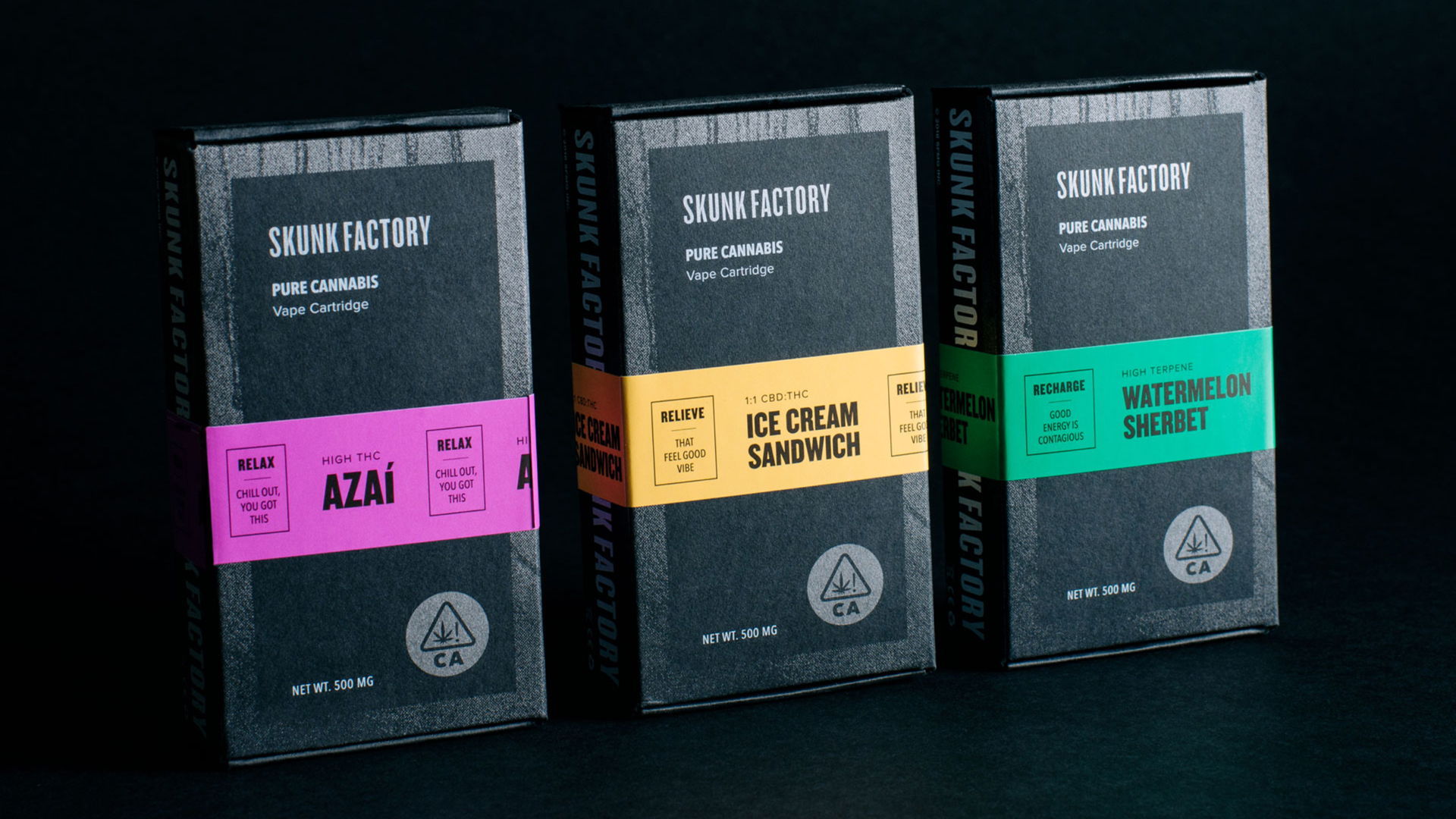
A noteworthy example is Skunk Factory’s vape kit packaging. Its packaging uses a well-matched blend of various stocks and coatings. They come together in a soft, matte black box with metallic finishes and bright “caution tape” inspired strips—color-coded by product line. The effect is at once eye-catching, understated, and utilitarian.
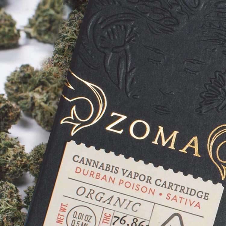
Federal and state regulations require the inner layer of cannabis packaging to be tear and tamper-resistant. Thus some technical creativity may be needed in terms of materials and coatings when printing on the interior. However, most brands remain focused on the outer packaging. Zoma’s Organic Pre-Rolls make an impression (literally) with a black paperboard box that incorporates embossing, foil stamping and perforation. Its packaging has a unique textural component and a distinctive yet not overwhelming complexity.
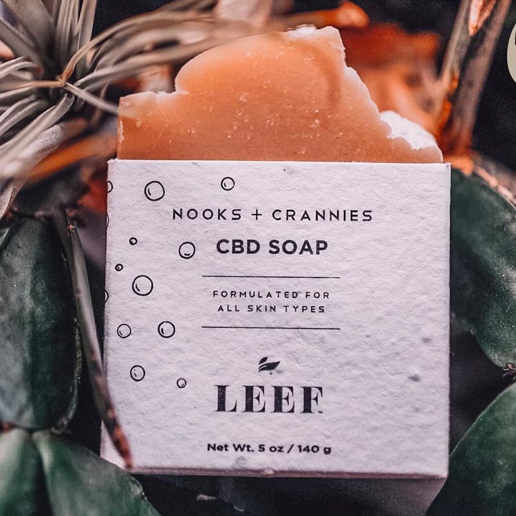
Current government regulations in the cannabis industry prohibit many forms of recycling, so cannabis packaging tends to utilize materials that are sustainably made and biodegradable. LEEF Organic’s plantable packaging is both. This CBD company’s packaging, which leans into the industry’s focus on sustainability (without compromising aesthetic), actually weaves small cherry tomato seeds into fully biodegradable paper fibers. This means the packaging is also edible (well, once it’s planted and grown into tomatoes, that is).
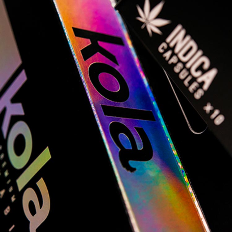
Finally, Kola’s CBD capsules are housed in a simple, black packaging, but use small swathes of holographic lamination to tremendous effect, highlighting the logo and custom font through a stark contrast between matte black and rainbow holographic lamination.
Child safety regulations pose additional challenges. Duallok’s innovative child-resistant packaging system utilizes plain paperboard to deliver intuitive but compliant packaging. Its patented locking design prevents opening unless two mechanisms are gripped and pressed, and it can be applied to a range of products.
INNOVATIVE CPG PACKAGE DESIGN HAS A HOME, IN THE HOME
Innovative CPG brands are leading the charge in sustainable packaging thanks to their customers, who figure that if they’re going to choose, they might as well choose for the environment. Increasingly, shoppers are recognizing that a big part of personal health depends on the health of the planet. That’s a problem for personal care brands since the majority of these everyday essentials are packaged in single-use plastic, which is a major source of plastic waste pollution.
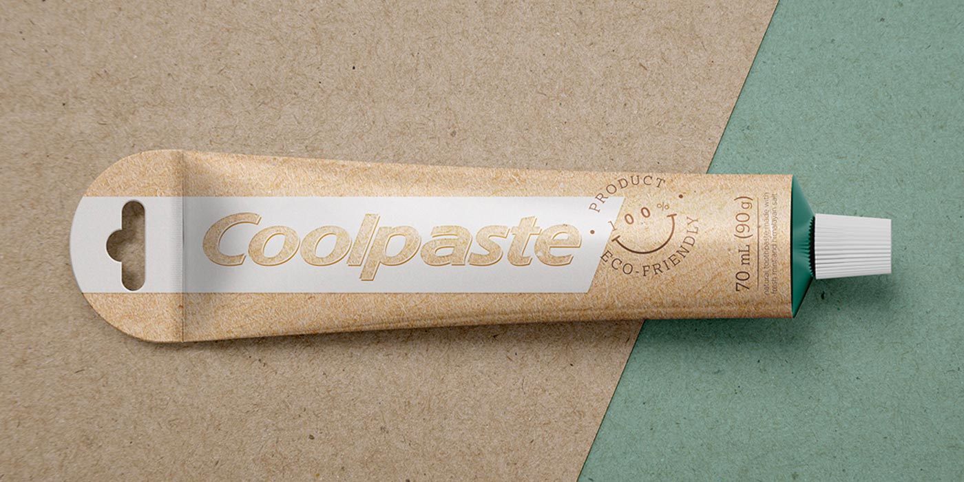
Colgate has committed to moving to packaging that’s fully recyclable by 2025. To do so, they’re developing new solutions that go beyond the typical. Inspiration may come from many sources, like this recent student project for a paper toothpaste tube prototype. Upping the ante, the big brand launched Smile for Good this year, a fully recyclable toothpaste tube and a first in the toothpaste marketplace.
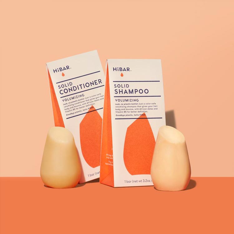
Liquids are a staple of personal care products. That makes them heavier to ship, but also harder to store using sustainable materials. A paper carton will get wet in the shower, and the combo of soapy hands and glass sounds downright dangerous. That’s why HiBAR shampoo and conditioner comes in solid bars that can be packaged in recyclable, compostable packaging—something we expect to see a whole lot more of in the future.
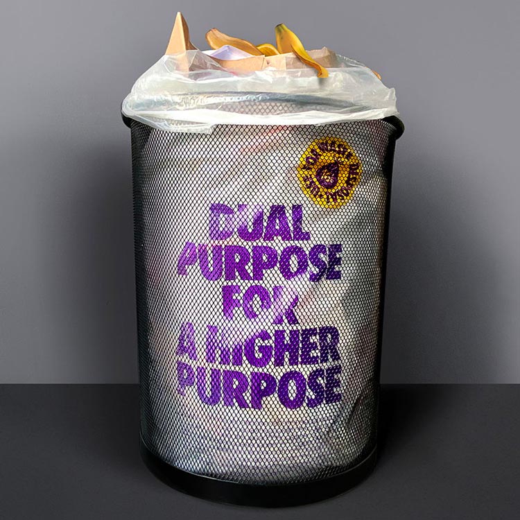
Toilet paper company Dual Purpose is also making big waves with their packaging bag, which does just what the name says. It not only stores and transports toilet paper but also serves as a 100% recyclable waste bag that fits perfectly to your bathroom trash can. For consumers who want to stand up for the environment (even while sitting down), this one is a standout.
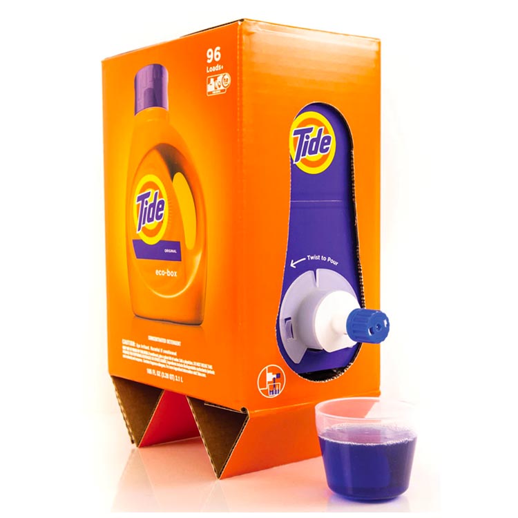
Although the design is now two years old, P&G’s Liquid Tide Eco-Box feels ready-made for today’s challenges. Constructed of shipping-safe, corrugated cardboard, and housing a sealed bag, the innovative design is optimized for sustainability. It uses 60% less plastic and 30% less water than the comparable Tide bottle. But it’s made for e-commerce as well. It’s lighter, and its boxy form takes up less space on trucks, meaning that shipments can be optimized.
COFFEE PACKAGING, COOKIE PACKAGING, CHOCOLATE PACKAGING… ALL THAT GOOD STUFF
Increasingly, consumers expect more than goods in containers. They expect experiences, and that includes the experience created by the packaging itself, especially for connoisseurs of goods like coffee and chocolate. In industries where purity of ingredients matters, minimalist design where the materials speak for themselves often dominates. However, the brands that stand apart are those that go the extra mile by tactically deploying interesting finishes such as a stripe of sparkling lamination.
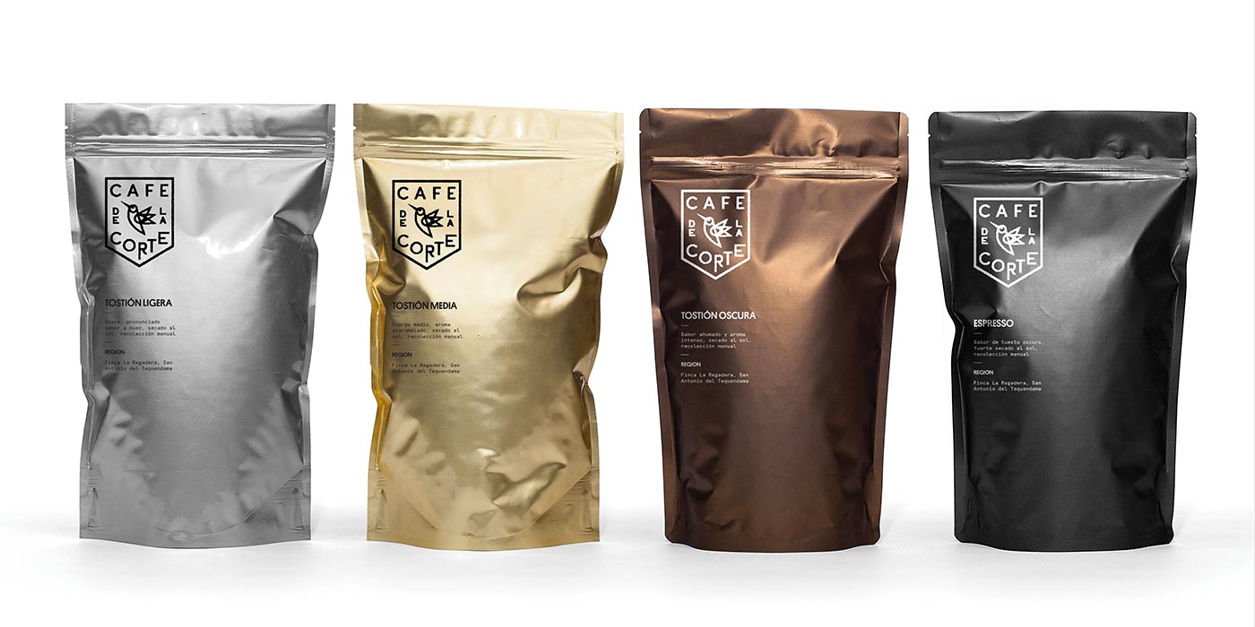
Café De La Corte’s coffee packaging leans on metallic effects to shine rather than busy design elements. Different blends or roasts are assigned different metals, from silver to gold to a beautifully muted copper, and the distinct metallic sheen puts less burden on the logo and font, which take up relatively little space on the packaging.
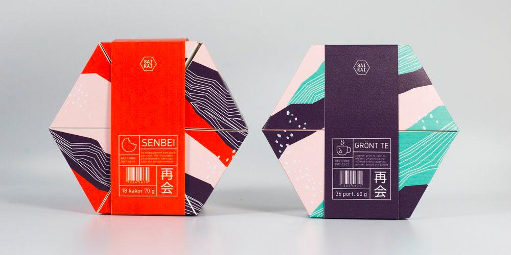
For a unique un-boxing experience, this cookie box concept project rolls out a new way of thinking about how to store and consume cookies, literally. The packaging houses cookies to keep them fresh, but can also be converted to a serving tray. Prior to opening, the packaging is also stackable and space-efficient when placed on a shelf (plus, it looks great).
THE MAKEUP OF PERFUME AND COSMETICS PACKAGING
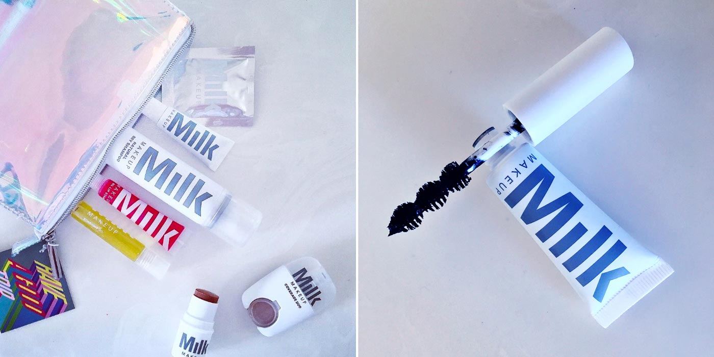
For all the transformational power of a good contour, cosmetic brands aren’t covering up when it comes to honest design. From high-end to budget buy, consumers expect their products to use simple, natural ingredients and help them look and feel their best. Because of this, there’s been an explosion of minimalist, sleek designs that faithfully represent the products inside. Think intricate line drawings for your eyebrow pencil box, bold patterns for bold color, warm floral for a flowery bath bomb, and cool black for dark, mysterious style. Taking the minimalist approach to an extreme is this simple and clean packaging in basic forms from Milk Makeup. No-nonsense, sans serif typography delivers the name of the brand and the product, and nothing more, with a pronounced lack of fuss.
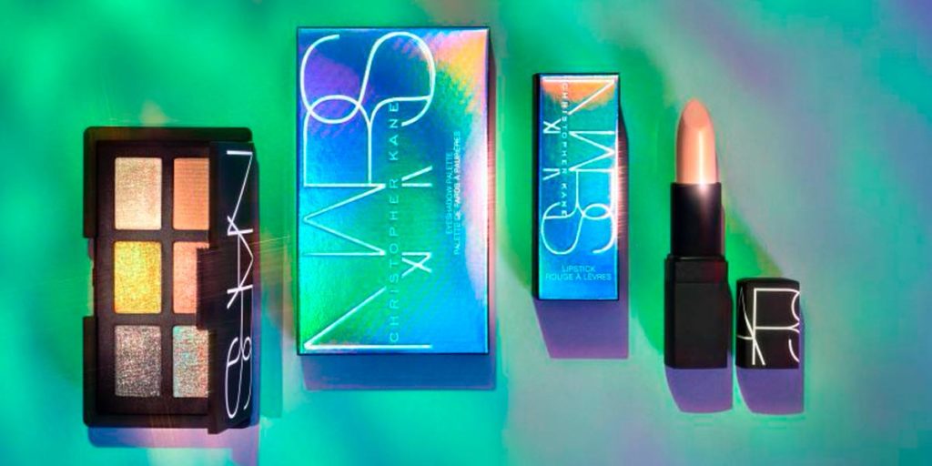
Against this minimalist backdrop, other brands are standing out by taking a different approach. One is NARS x Christopher Kane limited edition collection: Chrome Couture. This packaging is as beautiful as the product inside, laminated with shiny, holographic finishes and pearl gradients that are daring, alluring, and fun. The products are simple, and the bold packaging highlights their bold, beautifying power with holographic effects and metallic shine.
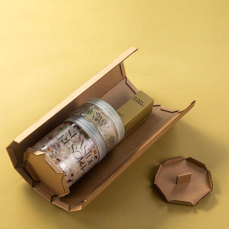
Grower Cosmetics’ Chill Box comes in a unique 7-sided micro-cardboard box that easily unfurls to showcase every item at once. After opening, the ecological outer box is flattened and ready for recycling, reminding buyers that the packaging is as natural and good for you as the hemp body oils and scrubs inside.
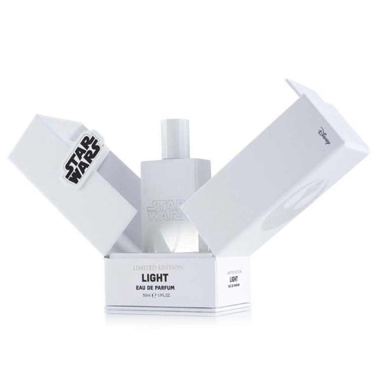
Packaging can also stand out by taking a more playful approach to its core challenge of storing and delivering the product. This whimsical box for a limited edition set of Star Wars perfumes goes far beyond the expected, and is clearly designed as a collectible.
ALCOHOL PACKAGING THAT STRAIGHT UP ROCKS
Much like coffee and chocolate brands, wine and spirits brands sell experiences, which means packaging is positioned to play a prime role. Research shows that alcohol packaging and branding are in the top 5 considerations for consumers when selecting alcohol to purchase, so there’s no doubt that an investment in creative packaging is crucial to any alcohol brands’ success. With new products appearing on store shelves regularly (a 2018 study showed a 15.5% increase in active craft distillers from the previous year), innovative packaging enables brands to stir up interest.
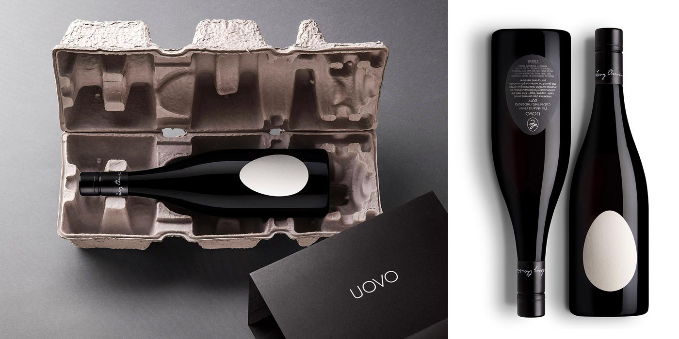
Unique packaging experiences pay greater dividends when they’re tied to other brand experiences. For instance, Uovo wine uses a unique wine maturation method involving egg-shaped tanks. As such, their bottle label—printed on eggshell-textured paper—is a stark, white egg. Reinforcing the brand’s stripped-back winemaking process, the outer box is similarly minimal. Humorously, it’s a fiber-based egg carton molded to the shape of the bottle. A black outer box, minimally adorned, finishes the design. In a field with countless brands jostling for attention through busy design, this focused attention to brand paired with an adventurous approach to materials is what really stands out.
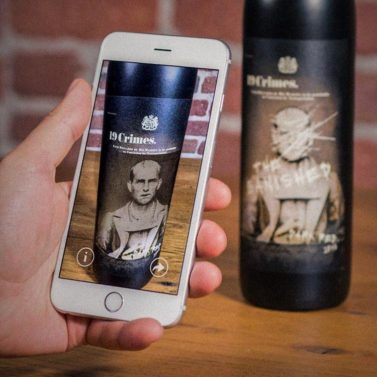
One limitation of packaging is space–or rather, the lack of it. 19 Crimes Wine solves this problem by extending the experience of its packaging to the virtual space. The brand features 19 different labels for their bottles, each showcasing a different 18th-century prisoner sent to Australia from Britain. With the brand’s custom-built app, users can focus their phone’s camera on the label, which makes the prisoner move and begin sharing his or her story.
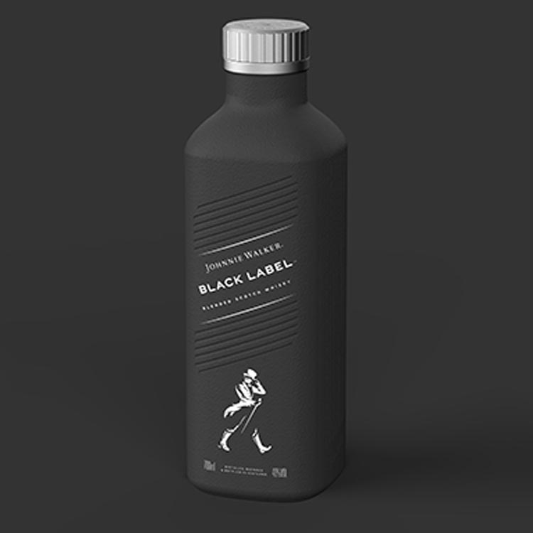
Eco-friendly means sustainable materials, but it also means lighter packaging for less expensive shipping and a lower carbon footprint. A new creation from Diageo’s Johnnie Walker Black Label Whisky is a standout example of how to do eco-friendly, creatively. While not due to hit shelves until 2021, the new Black Label bottle will be entirely paper-based, relying on substrates and coatings that meet direct contact regulations, prevent leakage, and are, on top of everything, visually stunning. The packaging itself features signature branding and a uniform black color, but the innovation is really in the use of paperboard, a more sustainable packaging material. The bottle bucks industry trends without sacrificing visual appeal or functionality—a sterling example of innovation in action.
UNPACKING PACKAGING IDEAS
All design is an answer to a problem, and package design is no exception. Still, it’s easy to look at beautifully designed packages and forget what the question was. So let’s take a minute to remember, because the challenges facing package design are also sources of innovation and creativity. Questions like these are why we need creative and innovative packaging:
- Can we package a product in a way that has a smaller footprint on the planet?
- Can we make a container that’s less expensive to ship?
- Can it be smaller?
- Can we track where a product has been?
- Can packaging help us fight a pandemic?
- Can it be stronger?
- Can it communicate what’s inside better?
- Can it stand out more on the shelf?
HAVE A CREATIVE PACKAGING IDEA?
To learn more about Case Makes, and how we can help bring your innovative packaging dreams to life, reach out here.
FREQUENTLY ASKED QUESTIONS
Packaging is the material structure that houses a product. It’s the tin to your cookies, the glass to your perfume, and the box to your tissues. Packaging protects your product and makes it easy to carry, but there’s more to it than that. It also promotes your product on the shelf, informs customers, and tells the story of your brand, which is more crucial than ever given the wide range of available products and the sheer number of existing brands.
Innovative packaging today solves packaging problems in unexpected and unprecedented ways. For example, the need for sustainability is driving a lot of the innovation of today, with emerging and established brands alike seeking alternative packaging materials that are sturdy, eco-friendly, and good for the planet. Innovative packaging may also be part of the product or provide a unique, interactive unboxing experience—like this chip container that fans out into a serving bowl or any of these 15 examples. IoT/smart packaging is also an emerging innovation—think temperature sensors, digital footprint tracking logs, or QR codes with video tutorials or recipe recommendations.
Primary, Secondary, and Tertiary. Primary packaging makes direct contact with the product (i.e. a toothpaste tube or beer bottle). Secondary packaging protects the primary packaging from damage and bundles products together (a six-pack versus six separate bottles). These two types of packaging are primarily what customers see when they’re shopping, where visual design matters most. Meanwhile, tertiary packaging typically takes place behind the scenes. The main purpose of tertiary packaging is to get bulk inventory from point A (i.e. warehouse) to point B (i.e. retailer) as efficiently and safely as possible so that it can be sold in stores. It can also be the shipping box that goes directly to the customer or the bag they use to carry it home.
Eco-friendly packaging produces little to no environmental waste because of how it’s made and what it’s made of. Environmentally-conscious packaging production facilities closely follow recycling protocols, use fewer energy sources, and cut down on carbon emissions, and eco-friendly packaging is biodegradable, compostable, recyclable, or reusable. Single-use plastics, for example, are not eco-friendly because they are non-renewable and don’t degrade naturally. Paper-based packaging is considered more eco-friendly, especially when it is FSC certified (Forest Stewardship Council). One increasingly popular method of reducing packaging’s environmental impact is “lightweighting.” This refers to the process reducing overall packaging mass, resulting in lighter, more sustainable, and often lower-cost packaging. Many people may not realize that green packaging is also cheaper to produce. That’s a win-win for the planet and for eco-friendly businesses.
This is a complex question—and beyond the scope of this article. In brief, though, package design begins by considering a problem that a particular package needs to solve. It may have to do with how the brand wants to be seen. It may involve a mission or purpose the brand is committed to like improving the customer’s experience or providing useful information. On some level, most of these challenges ladder up to the bigger challenge of how to get shoppers to buy the product at a profit for the brand. Package design has to address requirements such as logos, marks, and legal information as well as the needs and cares of the product’s audience. It requires knowledge of the materials, including substrates, coatings and inks, that are used in packaging, and an understanding of the visual codes that govern how consumers look at packaging.

